How Behavior Informs the Design
Having a product that will help people is only useful if they can and do actually use it.
Background
A Virtual Private Network (VPN) is a virtual pipeline that protects data that’s sent or received over a wireless network. It prevents hackers from gaining access to the data.
The client, is a VPN startup company that specializes in bank level encryption, and other services like compression and data monitoring. The product works on Computers, Androids and iPhones.
While the company was growing at a healthy rate, other competitors with a variety of business models were making the market tight. The founder of the company recognized that an amateur designed product would no longer stand out in the market.
I was hired as an independent contractor to utilize my knowledge of cognitive science. This was the first time the owner / founder had ever used a User Experience designer.
This was an opportunity to shape a product based on real behavior. As well as work on a product that genuinely helped users, it didn’t sell people anything that they didn’t need and provided a service that made them safe.
Outcome
Validation that research works is that there was a 43% improvement in conversion. Additionally, length of membership nearly doubled.
My Role
Apply Behavioral Science, Research, Interaction Design and Usability Tester
Challenges
Getting people to take appropriate security measures is hard. People naturally put their seat belt on while riding in cars because they understand the dangers of not buckling up. However, because the dangers can’t be seen lurking in the dark corners of the digital world getting the user to change their behavior became the goal of this project from both a moral standpoint as well as business one.
Project Challenges:
Working with a startup who never applied User Experience.
Educating about the Double Diamond process.
Getting the stakeholder to trust that research will yield understanding of problems and drive solutions.
Connecting user needs with Business goals.
The Solution
The results of both the usability test and user interviews gave way to a design that:
Educate users to the dangers of using unsecured WiFi’s
Build trust, assure user that the product does what it claims
Influence behavior, make protecting users so easy that they can’t help but make good choices
Drive Business, if all three of the above work, the business will grow
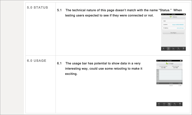
Educate
Key Screens that demonstrate ways we educated users…


Build Trust
Messaging and approaches that helped the user become comfortable with the app


Influence Behavior
Combine everything we learned to drive users to do something positive for themselves

How We Got There
Step 1 Research
Early on, it became clear there were two tools that would be key to addressing the challenges of this project:
Usability
User Interviews
They also served to get buy-in to the project as the findings were extremely compelling. Research Presentation & Usability Study
Usability
Findings
Onboarding cast doubt about the ability of the app to protect users
The most stunning reveal of the usability test was the “on boarding” experience. Similar to when taking a flight, most passengers have drawn a conclusion regarding whether they like the flight or not by the time they get to their seat. Things like booking the flight, the ride to the airport and security color the actual flight. People who were trying to on board the app formulated their opinion of the app based on this experience. Frequently, the app would crash and messaging wasn’t clear and create feelings of mistrust were more likely to abandon. If on boarding is smooth then people felt positive and were more likely to pay for the service. See Audit.


When do people form an opinion?
Most opinions are formed prior to the experience beginning, For example taking a flight, everything that happens prior taking off colors the experience
Research
Findings
Equally compelling to the usability study was the pattern we found from interviewing newly subscribed users and people who dropped out of the on boarding process. Four types of users with clear behaviors and needs.
Business Users (30% of user population)*
Traits:
Reads a lot (Knowledge seeker)
Impatient
Likely to be a road warrior
Very aware of the dangers of securing technology
30ish to 40ish age range
Use: Protect confidential work related documents
Extreme Security Conscious (20% of user population)*
Traits:
Runs every type of security software known to man
Works hard not to have an online presence online
Extremely knowledgeable of security issues
Panic when app doesn’t work
Use: To leave no imprint in the digital world. Some users are from countries that censor and consequently risk imprisonment or worse if caught using it- the performance stakes are high!
General Usage (40% of user population)*
Traits:
Has a vague understanding of security issues and practices
May have been hacked or had exposure to some sort of security breaches
Most likely uses for personal or recreational reasons
Use: To protect data
Miss-purchased or Never Engage (10% of user population)*
Traits:
Doesn’t understand the purpose of the app
Simply doesn’t fallow through and doesn’t complete the installation
Use: Doesn’t use after purchase
The Pitch…
The last step of getting buy-in from the owner of the company was conveying the findings of research in a way that was meaningful to him, that’s where the idea making a comparison of flying came in. I knew that the owner traveled extensively and connecting the impressions users had to his App to the experience of flying would had a deep connection. And it did, as I made this analogy I saw his posture change from slouchy to upright, I new I had him.
Step 2 Features
Findings of the research setup a framework for what the app needed should be and how it should be accomplished. While considering what features would help accomplish the tasks users needed, we relied upon the research findings as well as the goals to: educate, build trust and change behavior and are threaded throughout the process.
Step 3 Design and testing
iOS or Android, which first and what approach would we want to make for designing and coding for each? Should we use a cross platform? Ultimately we decided to code for both, some of the features that could exist on Android were sandboxed on iOS. As for design of each, we decided to conform to the guidelines for each platform so to leverage the users mental model of their existing phone.
Once the features were agreed upon, we took the approach of designing each of them before moving on to the next one. This was a semi agile method that allowed developers to build as we designed. First the flow was created, then a white board version of screens, usability testing, digitizing and passing on the the visual designer for branding.

Paper Prototype Usability Testing
Paper prototypes allowed us to iterate quickly as we designed each feature. Many rounds were conducted before moving on to digital prototypes.
Step 4 Making the features findable
Once enough features were developed the focus turned to investigating the architecture of the app. Nomenclature was extremely important. Most of the user population was not technical, so finding meaningful terms to describe what the app was doing and making features findable was key. Three rounds of cards sorts were conducted to insure menus and feature names resonated with the user.

Card Sorting
Making sure the nomenclature is accurate was in important, different people with different world views use different words.
Step 5 Final round of testing and repeat (Measure twice cut once)
Lastly, a final round of testing occurred in what was thought to be the dress rehearsal before we launched the app. At this point small tweaks were made to insure full usability.
This project has been active for a few years, it’s on of my favorites because it truly serves to help the user help themselves.